I took some photos using the ideas of Arjan Benning, where he used pegs to make letters. I thought I would just experiment with the pegs first, then see if I like the look of the letters next. I love how these turned out, especially the hand ones. So I'm thinking that I will do this again maybe on different parts of the body, like face, arms and back. I didn't love the face ones i've done so far, but I will take some more, maybe with bigger pegs and make them work.
Showing posts with label weird. Show all posts
Monday, July 21, 2014
Recent Shoot-Arjan Benning
Labels:
art,
blackandwhite,
face,
film,
humanpresence,
identity,
photography,
photographyblog,
photoshop,
research,
school,
sequences,
thephenomenolgyofshopping,
uniform,
urban,
weird
Monday, June 23, 2014
Kelly Nipper - Research
Kelly Nipper works with video, performance and photography. In her photos she uses still photos of models in awkward positions and uses contemporary dance to show movement. She also uses series of photos to show this and still life in her work.
This is three different photos and shows series


Walead Beshty - Annotations
Labels:
art,
asymmetry,
blackandwhite,
focalpoint,
leadinglines,
ncea,
photography,
photographyblog,
research,
ruleofthirds,
sculpture,
sequences,
street,
thephenomenolgyofshopping,
uniform,
urban,
veins,
weird
Monday, June 16, 2014
Walead Beshty - Research
Walead Beshty is an London born photographer but is based in Los Angeles.
Beshty earned a Bachelor of Arts from Bard College, then went on to get a Master of Fine Arts at Yale. His first solo exhibition was in New York in 2004 which was successful.
I am looking at his work, ''The Phenomenogy of Shopping and Dead Malls'' which is situated at Contemporary Art Centre, Long Island City, NY.
I really like how these are so weird and unusual and I think the concept of putting the body in awkward situations kind of fits in with the rest of my work. I want to try this with Logan but put him under the blanket, to still keep the dark theme coming through. I tried to take some like on my latest post, but I didn't like the look if them, so I am going to try it again using different lighting and in a different setting.

Labels:
art,
blackandwhite,
brandonstanton,
cinematography,
collage,
contrast,
environment,
humanpresence,
movie,
photography,
photographyblog,
photoshop,
school,
sequences,
shadow,
street,
uniform,
weird
Thursday, June 5, 2014
Artist Model Drawing Task
Focal Point
- In these photos an my drawings the focal point is the move moving the rocks, because there is a white boarder, it draws the eye to the image. Also the pyramids along the back draw the eye to the middle of the photo
Eye Level View
- The eye level view is perfect because it shows everything that is necessary in the photo. If it was from a birds eye view, the focus would be taken away from the man and put on the pyramids because it is the biggest part of the picture.
Landscape Format
- Allows the Pyramids to be seen in the photos. If the photo was portrait it would make the background smaller, and less a part of the picture. Which would make the concept irrelevant.
Symmetry
- The photo is quite symmetrical not in the way that its the same on both sides, but in the way that the subject matter is very evenly placed, apart from the man.
Rule of thirds
- The landscape of the Pyramids is along the line of the rule of thirds, so it does apply here.
Labels:
art,
blackandwhite,
conradlhall,
humanpresence,
identity,
movie,
ncea,
photography,
photographyblog,
photoshop,
sculpture,
sequences,
street,
uniform,
veins,
weird
Sunday, May 18, 2014
Planning My Next Shoot - Walead Beshty
This is the plan for my next shoot. I'm looking at Walead Beshty who uses models with thier faces and bodies places sunkin in into objects. As I am using the blanket for a prop, I was thinking about trying this concept with Logan and the blanket.
Monday, May 5, 2014
Artist Model Research - Duane Michals
Duane Michals is an American photographer, who uses slow shutter speed and sequences to show philosophy and emotion. He also uses series and multi-exposure in an innovative form. Michals began his work in the 60's where he was inspired by photojournalism and wanted to communicate and show narratives in photo form. He did this by using 'frame by frame' layout, also in a grid format. Michals uses text throughout his images to title a piece of work or the person in it and to push a statement across to the viewer.
Michals work has been exhibited in many exhibitions in the last 50 years, including The Museum of Modern Art-New York, Odakyu Museum-Tokyo, International Center of Photography-New York, Thessaloniki Museum of Photography-Greece.
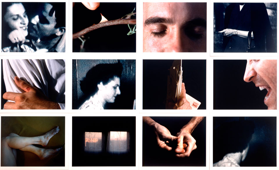
In this picture below Michals uses the grid, frame by frame format to position the photos. He uses text to Title the photo with the models name and the year in which the photo was taken. He uses black and white to show the strong contrats between the colours. this also shows alot of positive space, with the background, his hair, and skin being lighter than the rest of the photo. Making these areas of the photos really light makes the darkness in his eyes and mouth really stand out. Also his photos are very symmetrical and even, where the object or person is placed in the same place in all three photos, but still manages to show movement.
I have used his techniques of slowing down shutter speed and creating movement in a still photograph. By my strong use of positive space, show similarities in my work and the techniques of Michals. I've decided to not use black and white in my photography as I dont like the look of it.
Sunday, May 4, 2014
Latest Shoot - Duane Michals and Eileen Cowan
This is my latest shoot. I've used Logan with a plain black top on and a light background to make the photos look of high contrast and harshness.
I really think using an all white background is a contrast in what i have done in the rest of my work, where I have used black and negative space. I think these relate well with Eileen Cowan's work as my photos are showing high and obvious contrast between positive and negative space.
Duane Michals uses slowed down shutter speed quite prominently in his work which is the technique i was experimenting with in these photos. I want to develop this further and go back to my original idea of using sequences in panel 1.
Labels:
art,
blackandwhite,
body,
bodyparts,
contrast,
environment,
film,
humanpresence,
identity,
implied,
ncea,
photography,
photographyblog,
photoshop,
sequences,
shadow,
urban,
weird
Tuesday, April 22, 2014
New Photos Taken
These photos are the latest of what I have taken, I looked at Eileen Cowan and her use of positive and negative space, and I think for my concept the negative space works perfectly and suits.This also relates to Anne Nobles, 'Rubys Room' artwork. She uses people and their faces and shows a lot of texture through food and liquid.
Im next going to go back to the sequences idea and I need to relate this back to my concept.
My panel 1 is 3/4 finished, well I have enough content to cover the lot of panel 1, but I just need to work on sizing and composition of my images on my board. Also to use the sequence idea on my first panel mean I can develop it further through my folio.
Saturday, April 12, 2014
Artist Model Research - Eileen Cowan
I've beginning to look into other ideas and explore other artist models as I need to develop my folio further. The artist models I've started to look at are Eileen Cowan.
I've started to look at Eileen Cowan, who uses close ups of human features with lots of negative space and very little negative space to show the contrast between light and dark. I've decided that I want to explore my ideas further with this because I think it works well with the mood of my concept.
I've taken some photos so far with lots of negative and dark space. I really like the creepyness of these photos and I think they work really well. In my next shoot I'm going to take similar photos again, but with closeups of the arms and hands, and possibly use Logan's face aswell. The closeups will show more positive space with more light and shadow effects.
Labels:
art,
blackandwhite,
body,
bodyparts,
collage,
contrast,
creepy,
human,
identity,
ncea,
photography,
photographyblog,
photoshop,
sculpture,
sequences,
shadow,
street,
uniform,
veins,
weird
Subscribe to:
Posts (Atom)